 Google Rolls Out the New YouTube Interface
Google has launched a new major revamp of the YouTube interface: Since this July, at least a part of the users can have a glimpse at the new design of the world's most popular video platform as they opened its site. Apart from apparent improvements to the home page interface, Google also brought in a rather controversial change, marking a deeper integration of the service into the search giant ecosystem: the company's characterstic black stripe on the page top finally found its way to YouTube.
 YouTube's New Video Page Interface
'Make it cleaner'. That could be the motto for YouTube's new interface. Even though there were no deep changes to the home page of the signed-in user and even less so the site general home page, the overall impression they are making now is way neater than what we got to see less than a year ago. The motley diversity of buttons and links that prompted for critical voices as Google launched the previous site interface in December 2011 gave place to nice sleekness reminding on the site's old days.
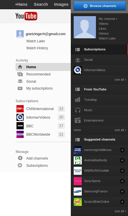 Side-by-side comparison
The side-by-side comparison of the left account column iliustrates that point in a very clear way. Instead of the tab mash next to your profile picture, you can now choose the only two tabs people really used in the old design: 'Watch later' and 'Watch History', making the area around your profile picture way more usable than before.
The Music and Entertainment tabs were incorporated into what is now called the Recommended tab, where you are offered videos that may be of special interest for you. To emphasize this point, YouTube provided each recommendation with a small explanation as to why you can like it, which gives you an idea about what you can expect from this video.
 The Subcription section
The annoying Suggested Channels section was removed from the user panel altogether. Reasonably enough, Google replaced it with the Subscriptions section, where you are now having a quick access to the channels you're subscribed to. A very nice stroke is that you're now displayed the number of new videos uploaded to your subscription channels since your last visit to them.
 The Video Page Tabs on YouTube
The stuff you get to see at the opening of a video page was also reduced to what an average user needs in the first place: video viewing and commenting. If you need anything beyond it, you can choose any of the Share, Add to, and Statistics tabs, where the corresponding features are hidden. It has drastically decreased the amount of unnecessary features on the page.
So, all in all, as one of my colleague editors has put it, 'the great thing about the new interface is that you're not confused anymore how you can get things done there.' Where you previously shrugged your shoulders, you can now head straight to the interface section you need. The secret is that now you really do need all of them.
 The Controversial Google Bar
A potentially much more controversial change to the YouTube design is introduction of the Google bar on the page top, signifying a closer integration of the service with the search giant's service network. Previously, YouTube was almost demonstratively kept aside from the rest of Google, accentuating the semi-autonomous status of the site. The current drift towards the other company services seems a logical consequence of the general Menlo Park strategy, implying the creation of a closed Google-based eco-system within the interface with Google+ as its cornerstone. The time will tell whether the users see it the same way as Larry Page.


Comments