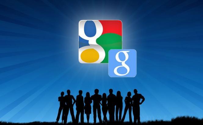
 Google Dresses in Blue
Google have changed their favicon once more. Before dwelling upon what changes were done by the company, let's formulate what a favicon is. For me this exact term was a discovery.
So, a favicon is also known as a shortcut icon, a Web site icon or a bookmark icon. In case this didn't clear a thing for you: this is a file containing one or several small icons, associated with a Web site or Web page. It can be seen in the address bar, tabs, the list of bookmarks.
A Piece of History
 Favicon Since 2009
The first Google favicon – the upper-case 'G' in a multicolor border was replaced by a lowercase purple 'g' in a white rounded-corner rectangle in 2008. Since then the company used the lower case variant, changing and modernizing it. The purple variant lived for a year and stepped aside before a white 'g' on a four color background. The latter is now replaced by a blue rectangle with the white 'g' on it. The favicon looks a bit metro-styled, as it is a way simpler than the previous one.
 The New Favicon
What Lies Behind the Icon Choice?
It is noticeable that Google is following Windows in their color choice. Before Windows 8 saw the world Microsoft had a four color icon for the product. Google had the same colors in the same combination but a bit turned clockwise and differently separated. The new Windows icon is blue, so is the Google's little 'g' icon now. Yet another similarity to think over – the red Windows Mobile favicon and the icon for Google +.
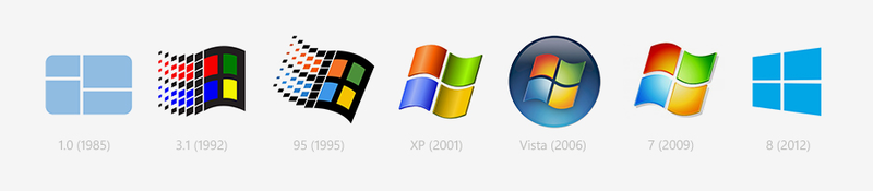 Windows Icon Evolution
Yet the most logic idea seems to be that the company wants to unify the images of different services to be totally recognizable. This has roots in the fact that a similar icon variant was used by Google for their mobile Google search applications for Android, iOS, Symbian. So they have already had it.
Whatever lies behind the new favicon, the result remains unchanged: now Google will be associated with blue, though some time will be needed to adapt. The first thing happening now is a disorientation in the tabs. I, for one, still continue to look for the colorful Google favicon.
Picture credit: flickr.com.


Thanks again!