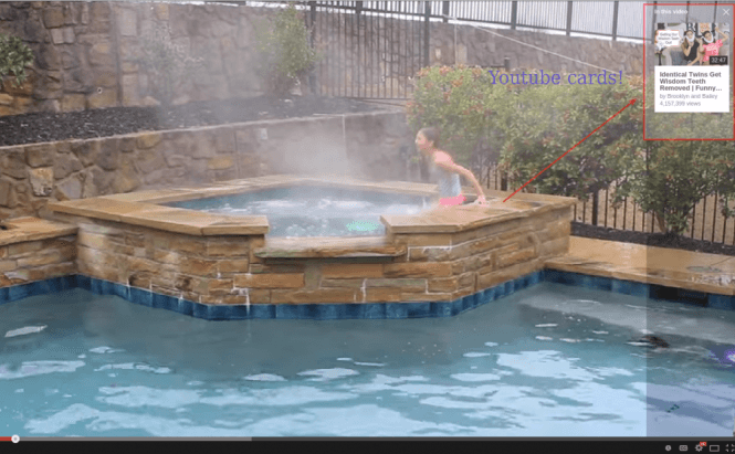
 Youtube Introduces Better Annotations Called 'Cards'
How many times in your life have you actually clicked on an annotation inside a Youtube video? Those usually take you to another Youtube or external video from the same "content creator", but who actually used these annotations? Well, I didn't, and I don't find it strange that creators (read channel owners) actually asked Youtube to provide something more flexible and better-looking. And Youtube complied, even though it took them some time to figure out how to make it cross-platform so that users visiting from mobile wouldn't be "punished" by getting half the content.
Youtube Cards, which is the code name for this new type of annotations, are going to be the new standard once they become just as feature-rich as the annotations used currently. You can check out an example of what a Youtube Card looks like on the image above; I personally do consider it to be better than those hyperlinked images messily arranged across the video frame. At this point, creators can already choose from six types of cards in Video Editor: Merchandise, Fundraising, Video, Playlist, Associated Website, and Fan Funding.
Source: Youtube Creator Blog


