 The iOS version of Cortana just got a new UI
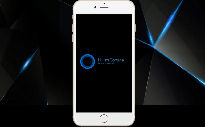
One of the few popular virtual assistants that are available on multiple platforms, Microsoft's Cortana, now has a brand new look on iOS. The IT giant has updated the iPhone and iPad version of its digital assistant and the 2.0 edition brings with it a few noticeable changes including UI changes, performance enhancements, redesigned reminders and more. The update has been rolling out for a couple of days, so it should already be available to all those who want to check it out.
If you ask me, the new interface isn't that much better, just a lot more purple, so this change is pretty easy to spot. The really important part of the update is the performance improvement, which allows the digital assistant to offer faster page translations and generally be a lot more responsive than before. Additionally, you will now see a lot more prompts, some design changes for calling and texting as well as prompts regarding the upcoming questions that you may ask. Lastly, the app's notifications also look slightly different.
Unfortunately for Microsoft, when it comes to foreign platforms, Cortana isn't as well as integrated as Google's Assistant is on Android or Siri on iOS, so even with this new update, the assistant's popularity probably won't grow that much. However, it's still nice to see the IT giant putting in some effort for its mobile users.
In case you prefer using Microsoft's assistant, you may also want to read: "Top 15 funniest Cortana questions and their answers".


